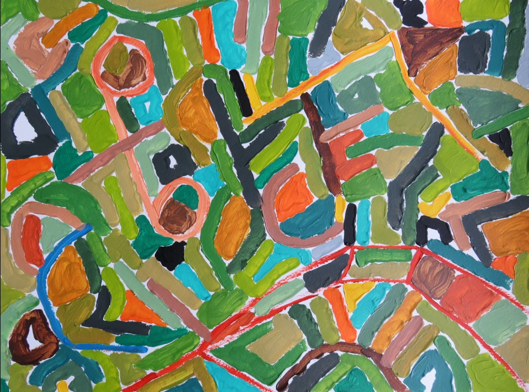
Ken Horne is an American multi-disciplinary artist based in Virginia as well as a psychotherapist by profession. He received his MFA from Vermont College of Fine Arts and his BA from the University of Colorado. His abstract paintings use color, line, and form to explore affect, chance, enoughness, flexibility, and not-knowing. Full of brightness, geometry and texture, his work is a vivid depiction of the psychological processes of our minds.
How did you enter your field/begin as an artist?
Ken Horne: I have painted since I was a young child. One of my earliest art memories is painting Native Americans on the easel in Kindergarten and connecting black X’s to make their long braids. My mother studied art history in college and took my brothers and me to museums growing up in Los Angeles and when we would travel. I took art classes in Junior High and High School and the majority of my electives at the University of Colorado were in studio art, painting and photography.
Can you take us through the process of creating (developing) one of your pieces/photographs?
K.H.: I basically photograph whatever I am drawn to. It is a primarily intuitive process for me. I am particularly interested in color and form, so something will catch my eye and then I’ll work with it. I like to find the beauty in things, which is sometimes a traditional idea of beauty, but more often I’m looking for a non-traditional beauty i.e. beauty in decay, beauty in the background, beauty in the awkward, the overlooked, the taken for granted. There are a few main categories most of my pictures fit into, which include art, structures, nature, found abstractions, and the occasional shot of my kids.
Much of my art work is about relating, how one shape relates to another, how one color affects another and so on, which is not unlike how therapy deals with how we relate to thoughts, feelings, beliefs etc. and the agency we have and the choices that we make in dealing with them.
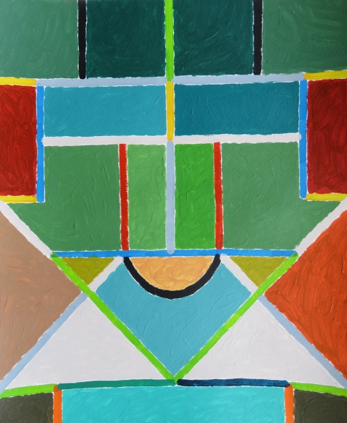 PHOTO CREDIT: KEN HORNE, GOING DOWN
As multi-medium artist, what forms of art are you most drawn to?
K.H.: Personally, I am usually drawn to painting more than other art forms, though that is not to say I think it has a higher standing, which is totally subjective. I am also very interested in sculpture and increasingly photography. It is nice to see that painting has come back strongly and I really enjoy work that exists in between art forms, for example, objects that combine elements of painting and sculpture and work to blur the lines between the two.
Related articles: “ALBERTO DI FABIO – THE SUPERNATURE EDITION“
How does your profession as a psychotherapist influence your work?
K.H.: Yes, I am a clinical social worker and have a private psychotherapy practice. In some ways, my art self and my therapy self seem totally separate and in other ways they seem to merge seamlessly. In general, good therapy is an art that requires some of the same presence, flexibility, decision-making, risk-taking and not-knowing that painting does. Much of my artwork is about relating, how one shape relates to another, how one color affects another and so on, which is not unlike how therapy deals with how we relate to thoughts, feelings, beliefs etc. and the agency we have and the choices that we make in dealing with them.
Color is light on fire.
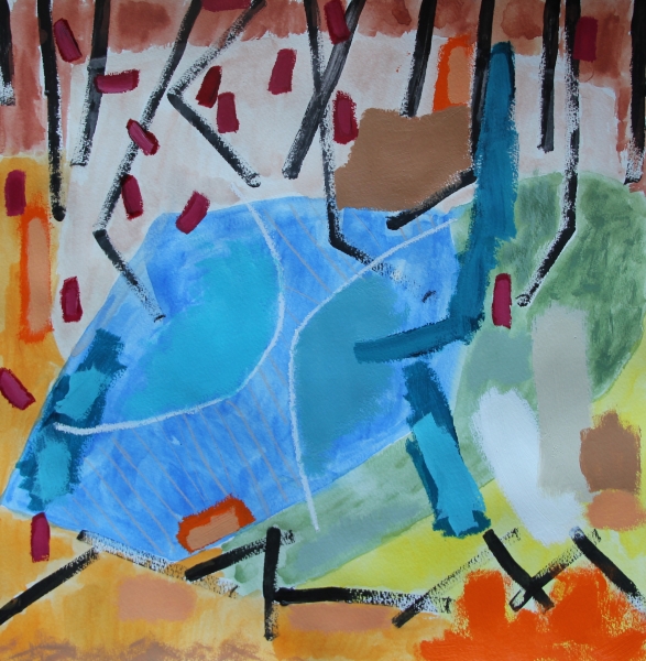 PHOTO CREDIT: KEN HORNE, UNDER BELOW DOWN
You have a very significant presence on social media, (specifically Instagram). How have you found that social media platforms have helped your success in your craft/business?
K.H.: In general, I do not engage with a lot of social media, though Instagram has been a good fit for me with its strong visual focus. It has been an exciting and effective way to engage with the larger art community. Being that I live in a relatively small town in Virginia, it has been a great way to both share my work with a wider audience and get feedback, as well as to see in real time the contemporary work that is being made and shown in New York, LA and beyond. I am particularly inspired by the many photographers and painters I follow and I am grateful for the easy access to a diverse range of work that the Instagram platform provides.
What are the essential themes you depict and focus on through your work?
K.H.: Shape and depth are essential elements in my work. Central themes in my work include affect, acceptance, chance, enough-ness, and not-knowing. I often think of my support as a field of awareness and the shapes/colors in my paintings as stand-ins for psychic phenomena (thoughts, feelings, beliefs, judgments etc.) so the interplay of these elements is a way of mapping a parallel process of consciousness in the mind. While my paintings are 2D, I like thinking of the field as a deep space where components move forward, receded, layer, imbricate and so on…as they do in the mind.
 PHOTO CREDIT: KEN HORNE, OPPOSING RANGES
What does color mean to you?
K.H.: I am endlessly fascinated by color. I love the Sam Francis quote, “Color is light on fire.” It is hard for me to articulate my pull toward color, but I am drawn to its power and the feeling it radiates. More specifically, I am interested in relationships between colors and the tensions and harmonies that can be created.
For a full mindmap behind this article with articles, videos, and documents see #psychotherapyinart
Could you talk us through the thought process behind a few works of yours?
K.N: Shelter Blocks, colored pencil on paper, 2015: This is a small colored pencil drawing on paper. Most of my work begins with a simple shape/color idea that comes to me as a flash in the mind. In this case, it was the two central rectangular shapes with the triangles on top. From there I played around with letting the remaining shapes and colors unfold according to feeling, intuition, and relationships. I try not to overthink decisions, but instead tend to work quickly. I did not intend this, but the final piece had a strong stained glass, churchy, religious feeling to me.
While my paintings are 2D, I like thinking of the field as a deep space where components move forward, receded, layer, imbricate and so on…as they do in the mind.
 PHOTO CREDIT: KEN HORNE, OVER ASSOCIATION OR COUPLING
BS Painting #1, mixed media on paper, 2015: I intended to make a series of these mixed media pieces (and I still may) but so far I’ve only made this one. I call them ‘BS paintings’, which stands for bumper sticker or bullshit alternatively. The idea was to make pieces incorporating bumper stickers I find thought-provoking, controversial, and/or simplistic. It is a mixed media piece on paper using paint, colored pencil, watercolor, oil pastel, and a bumper sticker. It leans a bit spiritual and incorporates some quasi-tribal mark-making.
Which Way is Up?, acrylic on cardboard, 2012: This is a piece I made during my MFA program at Vermont College of Fine Arts. It is a floor piece that involves elements of sculpture and painting. I made this piece as I was getting more interested in sculpture, installation, and getting my work off the wall. The exhibition space at VCFA was an old gymnasium with colored basketball lines on the wood floor. Many people found this distracting for an exhibition space, but I liked the color and geometry of it and decided to make a piece intended to play with these elements on the floor. It consisted of hundreds of small “4×4” minimal paintings on cardboard squares, which could be rearranged in various designs. The piece was meant to engage the space and deal with scale, perspective, assumptions, mapping and so on.
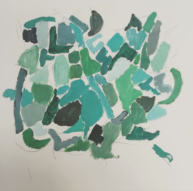 PHOTO CREDIT: KEN HORNE, BLUE LIGHT FIELD
Blue Light Field, acrylic and graphite on paper, 2015: This is a recent work on paper. It combines elements of painting and drawing. I start by making a loose, quick drawing of shapes and forms in pencil and then I go back and partially fill in the spaces with paint leaving some of the under-drawing and support visible. Here I am working quickly to access more of the subconscious and thinking through trust, acceptance, and enoughness. I like my work to question what art is and play on the line of enoughness and worthiness. I aim for the work to have both a crudeness and a sophistication at the same time.
Orange Abstraction, mixed media sculpture, 2015: This is a sculptural piece that I think of as a provisional abstraction. Unlike much sculpture historically, these pieces are temporary and fragile. I bring objects from different domains of life together in a form of unmixed media. The pieces sit with each other and relate to one another, but do not merge and combine a lot of sculptural assemblage work. Here I am interested in engaging the senses through color, shape, texture, scale, depth, and sometimes scent. These pieces are my way of exploring ideas of composition, temporality, and value. I like stripping objects of their typical social use value and combining them to highlight their formal qualities that are often overlooked or taken for granted in everyday use. In this way, there is a recalibration of value such that a seemingly worthless scrap of material is on an equal playing field and can be just as important, or even more so, than an object that typically has a more obvious, singular worth.
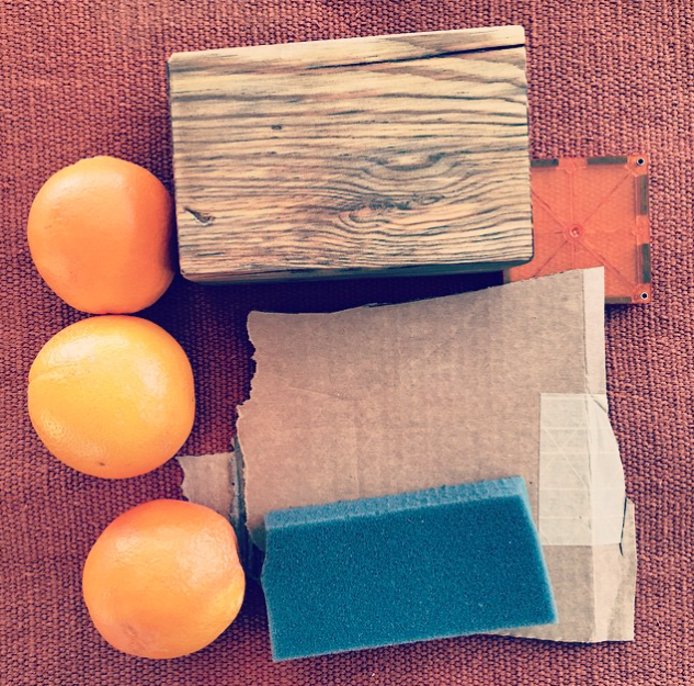 PHOTO CREDIT: KEN HORNE, ORANGE ABSTRACTION
Recommended reading: “ZARIA FORMAN – VISUAL AWARENESS“
—


