“That seems like fun,” I thought when I heard about Snapchat for the first time. I had seen many app logos before but never had I encountered a friendly-looking ghost on a bright yellow background. They got my attention, I was genuinely impressed by the boldness and spirit the app expressed, yet in my head I heard something that went like this: “But I’m an adult. That’s for kids. Maybe later. I just use WhatsApp and stuff.”
***
I have Snapchat now.
We judge a book by its cover, so you’d better get the cover right.
The relationship between color and psychology is unique. Have you ever wondered why different colors are used in familiar logos and why they affect a story we tell ourselves? What are the meanings we attach to them and how a brand’s personality and cultural background play a role in choosing a right color?
Colors offer us extremely useful cues that would be hard to come by otherwise. The subtle cues that deliver a specific message that text alone can’t capture. I can think of at least three reasons as to why you should obsess about the colors your business uses.
- As humans we do snap judgments 24/7, so it’s important to communicate your ideas clearly.
- Content we consume now is less text and more photos, infographics, and videos – so visual information has never been more important than it is today. We process visual information remarkably fast, at an astonishing rate of 60,000 times faster than text. Considering a readers’ attention span lasts 8-9 seconds … you want to make those seconds count.
- We are overwhelmed by too much noise, so understanding when your readers feel – and are – distracted, helps you make better decisions about visual content that serves them.
- It’s just good for business.
Let’s start with asking both how we want our customers to feel when they encounter a logo and how we want to communicate with them and transmit a brand’s personality.
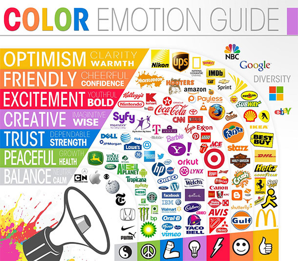
The color should primarily reflect the personality of a brand and shouldn’t be chosen solely based on underlying associations we have about colors. However, the primary colors are associated with a set of particular emotions.

Photo Credit: The Logo Company
White is easily associated with Apple when you think of their simple and sleek interfaces. Orange, used by Amazon, among others, radiates confidence. Red evokes feelings of power, excitement and passion, the color also used by the Virgin Group, and yellow is both playful and fun … but perhaps disliked most. Green entices users to think of money, but also represents Mother Earth, the color for youth and those enjoying life. Purple has historically been represented as a color for royals, and is used by brands like Yahoo. Blue, on the other hand, suggests trust, calmness, communication and happens to be the universally most-liked color, maybe because when our ancestors used to see blue – like a clear blue sky – it was a good sign.
Facebook uses a traditional blue, whereas Twitter uses a slightly lighter blue that conveys the funnier side of social media. The color needs to have the right hue to it, it should be something your users naturally embrace. What would be a better color than blue, then, for communication platforms like these?
The logo can be a key part of the brand, but the real brand is a result of all the frequent interactions customers have with the brand and encountering a brand logo is just one piece of the puzzle.
The color has to be a fit for the product in question and even more, it has to be fit for a story you want to tell your customers.
Snapchat uses yellow as its main color, which is perhaps slightly surprising considering its social foundation, but we know it’s different compared to Facebook. Yet, yellow just feels right for them. No brand should compromise on its most important customers and thus, it’s irrelevant if the color is “universally popular” or not.
Colors can be universally accepted but also highly personal at the same time and we attach different meanings to them because of our different experiences, backgrounds, and beliefs. In Twitter’s case, let’s notice how well the lighter shade of blue captures the spirit of the platform and is also likely to be the most liked color for users despite their cultural backgrounds.
Related Articles: “SONNY VU – THE MISFIT RENAISSANCE MAN”
In logos, the colors are often the first thing we pay attention to so they are without a doubt powerful when chosen right. However, I would go to great lengths to say that logos in and of themselves don’t matter much, unless they succeed in reminding us of what brands are here for.
To say that logos are a parallel to a brand’s identity is not correct. Logos are not the sole form of a brand’s identity, but serve to enhance its image with a unique visual aid. Logos can be a distinction between competitors using traditionally similar brand colors. Think of Coca-Cola vs. Pepsi. But a logo doesn’t make a brand.
The logo can be a key part of the brand, but the real brand is a result of all the frequent interactions customers have with the brand and encountering a brand logo is just one piece of the puzzle.

Photo Credit: Flickr/Aero Icarus
The question is, what does your brand stand for? When what’s behind it is amazing, delightful, touching and worth talking about, then customers can and want to become proud brand ambassadors
Thus, a logo could be impressive but if the representation of the logo does not match the soul and the brand of the company – if the customers expectations aren’t met, then it doesn’t matter how visually appealing it is to users.
Your message needs to be coherent and consistent, so you can’t say one thing and then do the other. The question is, what does your brand stand for? When what’s behind it is amazing, delightful, touching and worth talking about, then customers can and want to become proud brand ambassadors and whenever possible, display the items that signal about their relationship and support for the brand.
This gives a logo its meaning.
Having said that, we should first ask how we want people to speak about us, what our brands stand for and what’s truly unique in what we do, and only then start thinking of a logo.
We are familiar with the classic McDonald logo, the golden arches on the red background. This is the standard logo used in most countries worldwide. In some countries in Europe though, McDonald’s has swapped its traditional background for a deep green – to promote a more eco-friendly image and healthier lifestyle.
Here’s what’s important: aligning the words and the action. Going green and towards a healthier lifestyle is an increasingly growing trend in Europe that the fast-food industry – and McDonald’s – seeks to align itself with.

Photo Credit: Flickr/Lautenbach
McDonald’s is ranked sixth on the world’s most valuable brands list, and besides fast food, it is an icon of globalization and American culture. The golden arches on the red backdrop are an integral part of American culture and have remained relatively unchanged since 1955.
The lesson? No need to change something that works.
The bottom line: when it comes to brand building, including the brand personality and serving customers, more general color associations can be a great place to start. Consider current industry choices, the product, the brand, developing trends and – this might be counter-intuitive – what you would love to see. Then again, put the focus on the customer, because, at the end of the day, they decide if you succeed or not. Their red may not be the same as yours, your red may need to be the new orange.
_ _


