Maps are all around us. They follow us at our pace, wherever we go. In the exiguous space of our pockets, we can dispose of the whole world from all scales and angles.
We take maps so much for granted that we don’t realize sometimes how useful they can be to understand climate change and environmental policy. And few know that to be able to analyze accurate and updated maps we still rely on cartographers who make regular changes by hand.
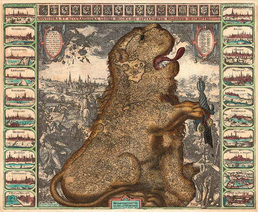
The techniques they use are of course very different from those of the past. The historical map shown as the cover of this article is called “Leo Belgicus”, it illustrates the current Benelux area (with some spots of northern France), drawn in the form of a roaring lion. The first version dates 1583, and the main variations were designed in the 17th century. It is an example of the overlapping of art and science over cartography in its golden age.
Cartography derives from the greek “carthes” (sheet of paper) and “graphein” (write), but cartography is a science (and an art) that arose much before paper was invented.
The antecedents of modern maps were in fact drawings on prehistoric cave walls, the first example being wall paintings found in the Anatolian city of Catalhoyuk. One of the subjects portrayed represents a nearby volcano, and beside it is a bunch of rectangular patterns signaling the presence of the city itself.
We don’t know the reason for which cavemen felt the need to depict their city on a wall but, witnessing these works, we can safely deduce that humans have an intrinsic tendency to visualize reality in a spatial perspective, through whatever medium they have at their disposal.
After centuries of continuous evolution in spatial representation, humans started to draw their surroundings on paper. The long era of (proper) cartography began. But technology, fueled by our growing need for efficiency, stimulated progress onwards, and it’s now 17 years since Google maps was first released.
Since then, map reading has been reduced, for the majority of people, to following a GPS navigation arrow.
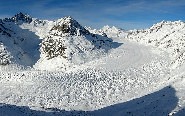
Modern cartography in the Swiss Alps
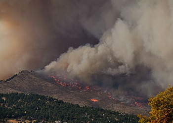
However, cartographers still need to update maps every few years, but for a much different reason than that of the exploration age: Climate change.
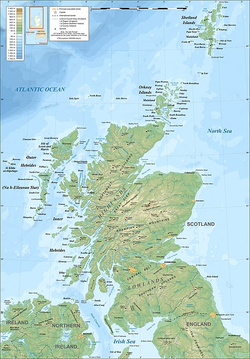
Zoey Poll, from the New York Times, interviewed a group of Swiss cartographers, whose work mainly consists in updating the layout of the Swiss alps. Apart from changes in infrastructure, the main source of work is melting glaciers.
The update is still carried out by hand, though using digital equipment. This means that these people are the first on earth to recognize the impact of climate change on the Alps:
“It’s sometimes frightening when you see such changes, I get a scary feeling that there’s something happening that we can’t control”
— Swiss cartographer Jurg Gilgen
The people specialized in map drawing are only a handful, and soon their line of work could disappear. Software programs are already able to carry out three days of human work in three minutes. This is not just a matter of nostalgia for the methods of the past, but it’s also a bit unsettling: We would virtually lose, as a species, the set of skills needed to perform a precise task, and rely on software to do it for us.
Engineers can program and maintain software, but in the absence of means to sustain them, they would not be able to replace the work of cartographers.
Related Articles: Geoscience as a tool in the twenty-first century | Connections That Matter: Climate Change and Gender Equality
Apart from the human factor, technology has only brought upsides. Digital maps can be updated and shared in a much faster and easier way. Moreover, they help policymakers to visualize complex geographical phenomena and to design policies accordingly.
Also the public in general benefits from them, as spatial information that accompanies articles can corroborate and help visualize the validity of verbal arguments aiding the reception of written messages.
There are, however, a few interpretative complications that may be difficult to detect for the average map user, undermining some of the advantages reported above.
Current challenges in map interpretation
The first issue is map generalization. All maps are simplified portraits of reality. If this fact, as a general notion, is known by everyone, its concrete implications elude many.
An example is the relative spatial proportion of countries depending on the proximity to the equator. The Mercator projection, the most widely used map design, represents countries closer to the equator as smaller than their actual entity (an unavoidable flaw derived from the adaption of a spherical structure to a flat one).
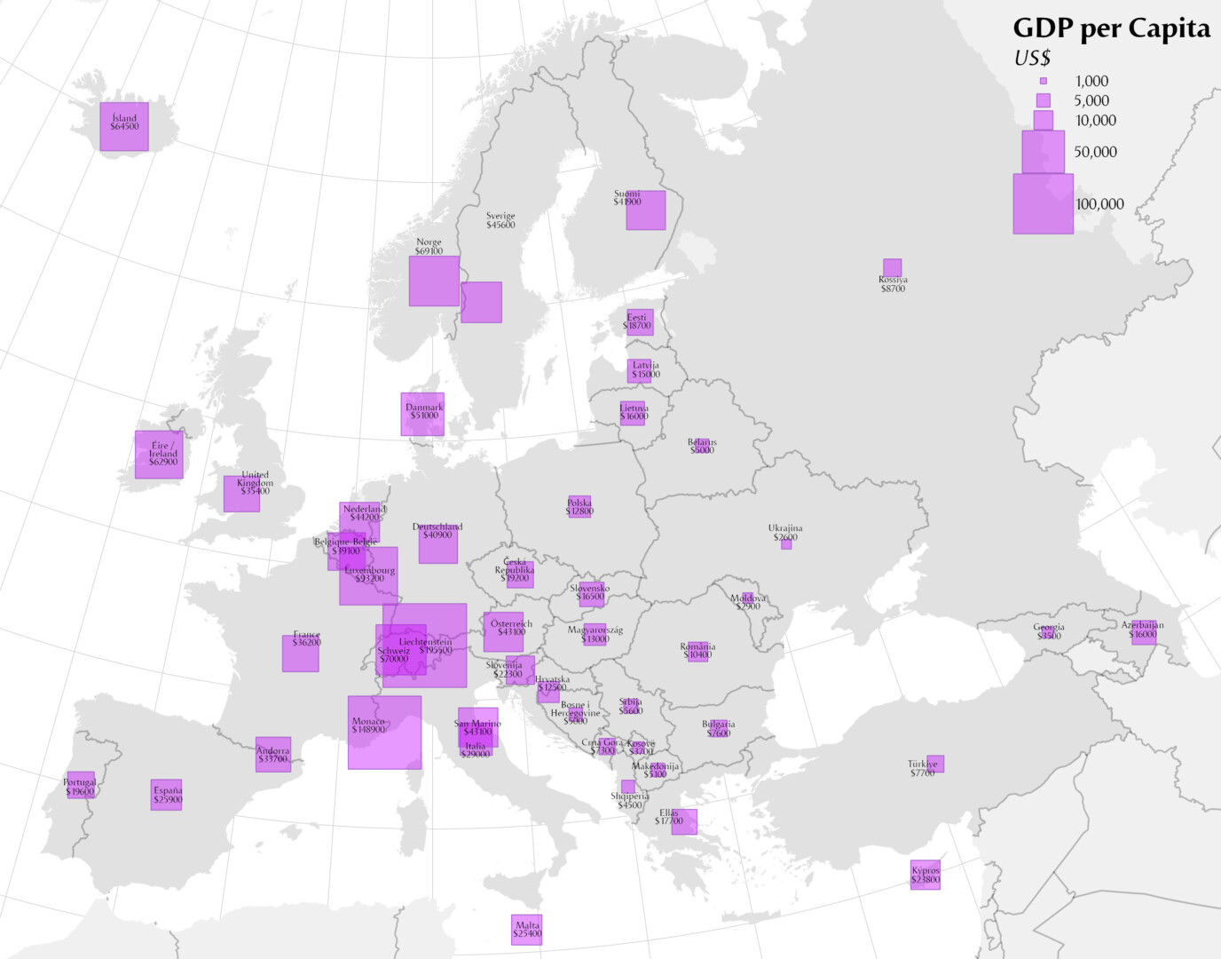
Some maps are accompanied by graphs and infographics. These versions are particularly useful for scientific divulgation and for policy-making.
However, these types of maps rely on data, adding another potential factor of bias to their interpretation: one must analyze closely the validity of the underlying data before taking the information received as an extension of reality.
Another final issue can be map literacy, the ability to read maps.
If in its basic structure this is a widely possessed skill, developed since elementary school, some more specific aspects can be unknown to many users, reducing again the informational advantages of maps. An example is the difference between a thematic and topographic map. Would you be able to give a precise definition of both?
As can be seen from the images, a thematic map displays the geographic pattern of a subject matter, while a topographic map portraits the morphology of a geographic area.
Maps, as witnesses of climate change, can become one of the best allies we have to implement effective environmental policies and help to ease the work of Swiss cartographers (and other cartographers in other countries) before their software-induced pension arrives. Eventually, once we’ll start to dialogue exclusively with machines, it will be even more important to understand in detail how to analyze maps. We just need to learn to listen to them, to “read” their visual language.
Editor’s Note: The opinions expressed here by Impakter.com columnists are their own, not those of Impakter.com. In the Featured Photo: The Leo Belgicus, by Claes Jansz Visscher. Featured Photo Credit: Public Domain.